| CIS 207 |
Web Page Development - HTML |

Chapter 7: Cascading Style Sheets
CSS (Cascading Style Sheets) allow us to create a design that can easily be
applied to other web pages to provide a consistent look and feel across the
entire web site. Using CSS, if we make a design change, we can change it in one
place - and avoid having to change every page that uses that design.
For a demonstration of what can be accomplished visually through CSS-based design, check out CSS Zen Garden. Be sure to check out different designs by clicking on each link on the right.
The New York Public Library encourages
their web authors to use CSS with the following words exactly:
"Laying out pages with CSS instead of HTML tables - or using CSS simply to
replace redundant, non-standard HTML hacks, such as invalid extensions to the
<font> tag or the <body> tag - provides the following
benefits:
- Conserve bandwidth (less markup for visitors to download)
- Reduce design/development time
- Reduce updating and maintenance time
- Increased accessibility (fewer, or no, HTML tables; no invalid junk
markup)
- Adhere to W3C recommendations, improving interoperability and
ensuring greater longevity (sites will not become obsolete)
- Better, more professional appearance (line–height, borders, padding,
margins)
- Increased readability (line–height, borders, padding, margins)
- More easily transition in future to more powerful standards such as XML
(because page content no longer contains junk markup)"
See the New York Public library online
Style Guide.
HTML and Page Layout
Early versions of HTML provided little support for page design and layout.
Although these pages load quickly, web page authors have little control over the
page layout - the browser picks the font, etc. Web authors looked for ways to
deliver more visually interesting documents. This has been done in three ways:
- Using HTML tag extensions - however, not all browsers support the various
tag extensions
- Converting text to images - however, images increase download time &
changes take lots of time
- Controlling page layout with tables - however, tables make HTML code more
complicated
Part of the problem is that the way HTML works is at odds with the
fundamental concepts of design theory. In designing any sort of document, one
wants to separate the content from the design. One should be able to create the
design and the apply the design elements to the content. For example, what if
you want to display all <H1> headers in red, 24 point, bold, Arial font? Because
the tags that specify these attributes are intertwined with the content in HTML,
you must locate all the occurrences of the <H1> tag and modify each one
individually.
History and Support of CSS
The limitations of HTML led to the creation of style sheets. A style is a
rule that defines the appearance of an element in the document. For example, a
style can explicitly define the exact appearance of an <H1> tag. The collection
of styles for a web page or web site is known as a style sheet.
The language for style sheets is known as Cascading Style Sheets (CSS). CSS
has been developed by the W3C, the same organization that develops standards for
HTML. The first CSS standard, CSS1, was released in 1996 and deals with
formatting. CSS2 was released in
1998 and deals with positioning. CSS is designed to augment HTML, not replace it; but learning CSS is like
learning a whole new way of formatting your web pages.
Browser support for CSS has proven to be uneven.
Check out the
CSS1 Leader Board and the
Web
Review's Compatibility Chart to see if your browser supports CSS. Actually,
it will support parts of it, just not all of it. As you know, we should always
check our web pages on different browsers running on different platforms. Here
are a few articles from webreview.com about CSS that illustrate some issues you'll want to
consider.
Be sure to check out the The W3C CSS
Home Page and Fear of
Style Sheets. You'll also find some great information (as of last update
1995-1999) on the web site
Ask Dr Web About
Cascading Style Sheets.
Our textbook offers several good links on CSS in Fig. 7-2 (listed below) that
you will want to review:
Style Types
We're going to take a look at 3 ways of employing CSS in your web pages: (Know
the difference)
- Inline styles - add styles to each individual tag within an HTML
file
- Embedded or global styles - style is applied to the entire HTML
file
- Linked or external style sheets - a linked or external style
sheet is a text file containing the style declaration.
We'll use each type, but, in order to fully benefit from the use of CSS you'll
want to use external style sheets.
Inline Styles
To create an inline style, you add the STYLE property to the HTML tag using
the following syntax:
<tag STYLE="style declarations">
where tag is the name of the tag (H1, P, etc.) and
style declarations are the styles you'll define for that
particular tag. A style declaration consists of attribute names that control
such features as the font size, color, font type, followed by a colon and then
the attribute's value. Multiple attributes can be used as long as you separate
each one by a semicolon. The general syntax for the style declaration is:
attribute1:value1; attribute2:value2; ...
CAREFUL: A common mistake is to forget the semicolon separating the
attributes. If it is missing, your browser may not display any of your style
changes.
Here is an example that will make an H1 header appear in a gold
sans-serif font.
<H1 STYLE="color:gold; font-family:sans-serif">
Embedded Styles
Style Syntax
- Selector - the HTML tag you want to style (can be...).
- Declaration - attribute: value;
SELECTOR DECLARATION
h1 {color: red;}
Attribute Value
- Attribute - style attribute (what you are setting) followed by a colon
- Value - the attribute/property value, followed by a semicolon
To keep us from having to insert inline styles into every H1 header tag, we
could create an embedded style for all H1 headers. To create an embedded style,
insert a <STYLE> tag within the head section of your HTML file. Within the
<STYLE> tag, we'll enclose the style declarations for the entire web page with
the following syntax:
<STYLE TYPE="style sheet language">

     style declarations

</STYLE>
The style sheet language identifies the type of style language used in the
document. There are several style languages, but the most common language (and
the default if omitted) is "text/css".
Selectors and Declarations
Style declarations within the <STYLE> tags obey the following syntax:
selector {attribute1:value1; attribute2:value2; ...}
where selector identifies an element in your document (such as a header or
paragraph), and the attributes and values within the curly braces indicate the
styles applied to all the occurrences of that element. The collection of
attributes and values is also referred to as the declaration of the
selector.
To display all H1 headers in the HTML document using gold sans-serif font,
use the following embedded style:
<STYLE>

     H1 {color: gold; font-family: sans-serif}

</STYLE>
In this example, H1 is the selector and the text in the braces is the
declaration. Since we used the <STYLE> tags, we didn't have to include quotes
around the attributes and attribute values as we did for inline styles.
Grouping Selectors
Apply the same declaration to a group of selectors by including all of the
selector names separated by commas. To see all headers formatted in a gold
sans-serif font, we'll use the following style declaration:
<STYLE>

     H1, H2, H3, H4, H5, H6 {color:gold; font-family:sans-serif}

</STYLE>
Since we did not define the size of the header text in our style declaration,
the font size for H1, H2, etc. is not changed.
I'll often use an embedded style to set the font face and size for a table.
This saves having to enter the font tag for every cell. Check out this example
and be sure to view the source code -
198ln07EmbeddedStyleStyleForTable.htm.
External Style Sheets
To create styles that apply to an entire web site, we'll create a text file
containing our style declarations, and then we'll create a link to that file in
each page of the web site. The text file is called a style sheet.
To create a style sheet to make all headers on the web site formatted in a
gold sans-serif font, open a text editor and place the following line in the
file:
H1, H2, H3, H4, H5, H6 {color:gold; font-family:sans-serif}
Then, save the file (the style sheet) using NAME.CSS - Most style
sheets have the extension ".css" - though this is not a requirement. Within
a style sheet, we don't need <STYLE> tags, just the style declarations.
Linking to Style Sheets with the <LINK> Tag
Add the <LINK> tag to the HEAD section of your HTML file with the following
general syntax:
<LINK HREF=URL REL="relation_type" TYPE="link_type">
where URL is the URL of the linked document, relation_type establishes the
relationship between the linked document and the web page, and link_type
indicates the language used in the linked document. To link to a style sheet,
the value of the REL property will be "stylesheet" and the value of the TYPE
property should be "text/css". Thus, to link to a style sheet named "ABC.css",
the <LINK> tag would be:
<LINK HREF="ABC.css" REL="stylesheet" TYPE="text/css">
To apply a style to another page, simply add the <LINK> tag to each HTML
file. This is an important reason to use CSS. A designer can change one style
sheet and change the look of all the pages on the site.
Linking to Style Sheets with @import
Another way to link to a style sheet is to use the @import command, which
accesses the style sheet definitions from another file. To use @import with your
styles, enclose the @import command with the embedded <STYLE> tag as follows:
<STYLE>

   @import url(stylesheet.css);

   style declarations

</STYLE>
where stylesheet.css is the URL of the style sheet file. If you want to
access a style sheet from within another style sheet, you simply add the @import
command to your style sheet file:
@import url(stylesheet.css);

styles
The advantage of this approach is that it allows you to easily combine
different style sheets. For example, a company could have a basic.css for all of
its web pages. A department could create a style sheet named departmentone.css
that adds a few styles applicable only to that department. The contents of the
departmentone.css file would read:
@import url(basic.css);

styles specific to this department's pages ...
and the resulting collection of styles would contain the basic style
definitions, plus the department styles.
The @import command provides greater flexibility than the <LINK> tag in
working with multiple style sheets.
Although our book notes that the @import command did not work in Netscape
4.7, it works fine in Netscape 6. Others knock Internet Explorer's support for
the @import command because in versions 4, 5 & 5.5, IE allowed the @import
command to work, even if it appeared at the end of the document style sheet, which
was technically in violation of the CSS1 specification. It works now on most all
browsers, even Opera, and on Mac versions of IE and NS browsers. However, it is
a good idea to check your code on all browsers, OS, etc.
Style Precedence
If you attempted to use all three methods of applying styles to your web
site, and you mistakenly used different formatting for the same content,
precedence is determined in the following order: 1. inline, 2. embedded, 3. linked.
Style Inheritance
Web pages will invariably have elements placed within
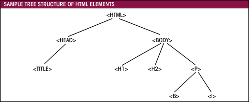 other elements. For
example, a web page might have a bold tag, <B>, placed within a paragraph tag,
<P>, to create boldface text within the paragraph. You can display the
relationship using a tree diagram. Take a look at the diagram, Sample Tree
Structure of HTML Elements.
An element that lies within another element is called a descendant or
descendant element. An element that contains another element is called the
parent or parent element. The <BODY> tag is the ultimate parent, since it
contains all of the other tags used to format the content of a web page.
Using the principle of inheritance, styles defined for each parent tag are
transferred to that tag's descendants. Using the diagram, we could change the
font color of every element in a web page using the following style definition:
H1, H2, P {color: blue}
and all of the H1, H2, and paragraph text will appear in a blue font. Any
boldface or itallic text using the <B> or <I> tags within a paragraph tag will
also inherit this blue color. A simpler approach is to define the style for the
<BODY> tag. You could set all font color to blue using the style definition:
BODY {color: blue}
Since all elements are descendants of the body element, all the text on the
page will appear in blue.
You can override this inheritance by specifying a different style for the
element's descendants. For example, look at the following style definitions:
BODY {color: blue}

H1, H2 {color: red}
These definitions will cause all text in the web page to appear in blue,
except the H1 and H2 text (and any descendants of the H1 and H2 elements),
which will appear in red. Order in which you enter the style definitions does
not matter, although it is considered good practice to enter style definitions
in an order that follows the tree hierarchy.
Contextual Selectors
Notice in the diagram, Tree Structure With Two <B>
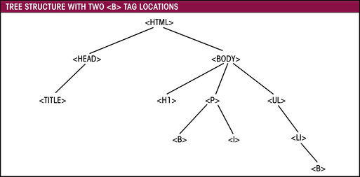 Tag
Locations, that the <B> tag appears in two locations: within the
<P> tag and within the <LI> tag. If you wanted to display the boldface text
within the <LI> tags in blue, but wanted the rest of the bold text to remain
red, you could not simply enter the following style declaration:
B {color: blue}
This is because all boldface text will appear in blue, including the text
that does not lie within the <LI> tags.
To restrict the application of this style, you use a contextual selector,
indicating the context in which the style is to be applied. For example, the
declaration:
LI B {color: blue}
tells the browser to apply the blue color to any boldface text
that lies within the <LI> tag. Any boldface text located elsewhere in the web
page will not be affected by this style.
Font and Text Attributes
Now, let's learn more about the style language of CSS. Let's begin by
examining the font-family attribute.
Font Families
The font family attribute allows you to choose a font fact for your web page.
CSS works with two types of font faces:
- specific - a font such as Arial, Times New Roman, etc. that is installed
on user's computer
- generic - a general description of a font type. CSS supports five generic
font types; serif, sans-serif, monospace, cursive, and fantasy.
Since generic fonts may produce unpredictable results since your users' fonts
may vary, it is better to use a specific font whenever possible. To do this
effectively, you should give the browser several fonts to choose from - this
way, browsers will attempt to use your first choice font, then your second, etc.
It is wise to list specific font names first, and end the list with a generic
font name - to be used as a last resort, if none of the specific fonts can be
found. Separate one font name from another with a comma. For example, look at
the following style declaration:
BODY {font-family: Times Roman, Century Schoolbook, serif}
This declaration will cause the browser to display body text in a Times Roman
font. If that font is not on a user's machine, the browser will look for Century
Schoolbook, and if that font is also missing, the browser will use whatever
serif font is available.
Font Size
In CSS, you use the font-size attribute to manage font sizes. There are four
ways of expressing the value of this attribute:
- As a unit of length
- Using a keyword description
- As a percentage of the parent element
- Using a keyword expressing the size relative to the parent element
Expressing font-size attribute as a unit of length
You can use absolute or relative units.
Absolute units define the font size based on a standard unit of measurement.
Size values can be whole numbers (0, 1, 2, etc.) or fractions (0.5, 1.7, etc.).
Units can be mm (millimeter), cm (centimeter), in (inch), pt (point), and pc
(pica). There are 72 points in an inch and 12 points in a pica. To make H1
headers appear 1/2 inch in size, you can use any of the following:
H1 {font-size: 0.5in}

H1 {font-size: 36pt}

H1 {font-size: 3pc}
These measurements are useful if you intend to have users print the web page
on a standard 8 1/2 x 11 inch paper. They don't work as well in the browser
windows, where the size of the user's monitor and resolution is unknown. To
overcome this problem, we can use a relative unit.
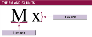 Relative units expresses the font size relative to the size of a standard
character. There are two standard typesetting characters, referred to as "em"
and "ex." The em unit is equal to the width of the capital letter "M" in the
default font used by the browser. The ex unit is equal to the height of a small
"x" in the default font.
The em unit is more useful for page design, because 1 em is exactly equal to
the browser's default font size for body text. For example, if the browser
displays body text in a 12-point font, the following style:
H1 {font-size: 2em}
will cause all H1 headers to be displayed at twice the default font size, 24
points in this example. You can specify fractional values. The em and ex units
are scalable in that they can be used under any monitor size or resolution and
retain their relative proportions.
The final unit of measurement is the pixel, entered with the unit
abbreviation "px". A pixel is the smallest display element on your computer
monitor. To set the size of H1 headers to 23 pixels, use the style:
H1 {font-size: 20px}
Pixels give you the finest control over size since you're working with the
smallest display element. However, pixels should be used with caution since the
user's monitor resolution will dictate the size of a pixel. Text that is 10
pixels high may be perfectly readable at a monitor resolution of 640 x 480, but
it can become unreadable if your user's monitor is set to1024 x 768.
Expressing font-size attribute as a keyword
There are seven descriptive keywords: xx-small, x-small, small, medium,
large, x-large, and xx-large. These seven keywords match the seven values of the
SIZE property in the <FONT> tag. For example, to format an H1 header with
the largest font size, you can use either the HTML command:
<H1><FONT SIZE=7>The Header Text</FONT><H1>
or the style:
H1 {font-size: xx-large}
Expressing font-size attribute as a percentage
You can express font size relative to the size of the text's parent element
using a percentage. For example, the following style definitions increase the
size of boldface text to 150% of the size of its parent element. Since the body
is set to 12 point type, boldface body text will be rendered in 18 point type.
BODY {font-size:12pt}

B {font-size:150%}
The text will appear in the browser as follows:

Expressing font-size attribute using keywords
We can use the two keywords "larger" and "smaller" to make the font one size
larger or smaller than the size of the parent element. To make the H2 header one
size larger than the body text, you could use the following style:
BODY {font-size: medium}

H2 {font-size: larger}
Word, Letter and Line Spacing
Use the letter-spacing attribute to set the space between individual letters
with the syntax:
letter-spacing: size
where size can have the value "normal", which allows the browser to determine
the letter spacing. Or, size can be expressed in the same units used to describe
font size (inches, millimeters, centimeters, em units, etc.). To set the letter
spacing for text in a paragraph to 0.5 em, you would use the style:
P {letter-spacing: 0.5em}
The word-spacing attribute controls the amount of spacing between words:
word-spacing: size
where size is either equal to "normal" or to a specific length as described
above.
You can use the line-height attribute to modify the vertical space between
lines of text. Typesetters use the term leading to describe the vertical
space between lines, because, many years ago, a strip of lead was placed between
lines to separate them from each other. To set the line height, use the style:
line-height: size
where size is either a specific length, a percentage of
the font size, or a number representing the ratio of the line height to the font
size. The default ratio is 1.2, allowing 20% extra space. We can double space
text by using the ratio 2. The typesetting term, "set solid" means to set
the leading to the same size of the type, which is how you'll see many magazine
articles. We can do this with CSS by setting the ratio to 1.
Aligning Text Horizontally and Vertically
The align attribute aligns text horizontally as follows:
text-align: alignment
where alignment can be left, center, right, or justify.
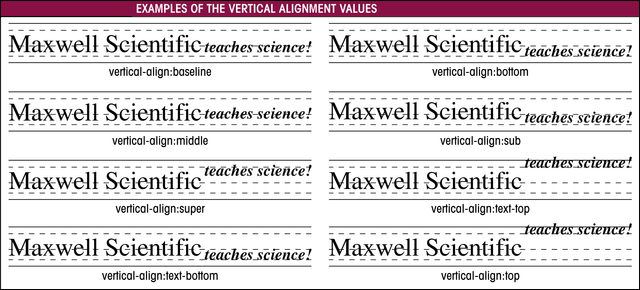
We can vertically align elements such as text and images relative to the
surrounding text with:
vertical-align: alignment
where alignment can be one of the following values:
| ATTRIBUTE VALUE | DESCRIPTION |
| baseline
| aligns the element with the baseline
|
| bottom
| aligns the bottom of the element with the bottom of the lowest element (text or graphic) in the line
|
| middle
| aligns the element in the middle of the text
|
| sub
| aligns the element as a subscript
|
| super
| aligns the element as a superscript
|
| text-bottom
| aligns the element with the font's bottom
|
| text-top
| aligns the element with the top of the tallest letter
|
| top
| aligns the element with the top of the tallest element (text or graphic) in the line
|

Alternatively, you can enter a distance or percentage that the element will
be raised relative to the surrounding text. A positive value or percentage
raises the element above the surrounding text, and a negative value or
percentage lowers the element. For example, the style:
vertical-align: 50%
raises the element by half the line height of the surrounding text, while the
style:
vertical-align: -50%
lowers the element by half.
Indenting Text
The syntax for indenting the first line of a paragraph is:
text-indent: indentation
where indentation is either the length (in absolute or
relative units) of the indentation or a percentage of the width of the
paragraph. An indentation value of 5% indents the first line by 5% of the width
of the paragraph, while an indentation value of 2em indents the first line by 2
em units. Values can also be negative, which extends the first line out by the
value or percentage and indents the rest of the lines in the paragraph. See
sample.
Special Text Attributes
CSS provides three attributes for text effects:
- text-decoration - underlines text,
or place a line over or through your text, or make text blink
- text-transform - capitalize first
letter of each word in a paragraph, all caps, all lower case
- font-variant - small caps (capital
letters that are the same size a lower case letters)
Font Attribute
Use the font attribute to group many of the individual text and font
attributes into one single attribute. The syntax for the font attribute is:
font:font-style; font-variant; font-weight; font-size/line-height;
font-family
where each of these attributes are the values we've just learned.
The following two style forms are equivalent:
H2 {font-style: italic; font-variant: small-caps; font-weight: bold;
font-size:3em; line-height:0.8em; font-family: Times Roman, serif}
H2 {font: italic small-caps bold 3em/0.8 Times Roman, serif}
The font attribute requires that you specify the font size and font family.
The other font attributes are optional.
Color and Background
Color Attribute
As in other HTML tags, we can use color names or color values. Although we
can use the same hexadecimal form of the color values as we did with HTML, CSS
allows us to enter the color values directly, or as a percentage of the RGB
values. For example, to format the body text in the color Teal, which has a RGB
color value of (0,128,128), 008080 in hexadecimal, we can use any of the
following styles:
body {color:teal}

body {color:#008080}

body {color:rgb(0,128,128)}

body {color:rgb(0%,50%,50%)}
Background Color
You can change the background color by changing the background-color
attribute. You can apply background color to almost any element in your web
page, not just to the page itself. You will change the background color for text
marked with the <BLOCKQUOTE> tag, which indents blocks of text, in your tutorial
assignment.
Background Images
Background images can be applied to an entire page or to any element on a
page. For example, you can set all bold text to appear with a background image
for a special effect. (see pg. 7.32) You can control four attributes of the
background:
- image file used
background-image:url(image)
- how image is repeated
background-image:repeat (image is tiled both horizontally
and vertically)
background-image:repeat-x (image is tiled only horizontally)
background-image:repeat-y (image is tiled only vertically)
background-image:no-repeat (image is not repeated at all)
- where image is placed
background-position:units/percent_from_left, units/percent_from_top

  P background-image:url(image); background-position:10% 20%}

  or use keywords: left, center, right, top, center, bottom.
- whether image scrolls with the display window
by default, background images move with the page's background when scrolled.
Change it with:
background-attachment:attach (where attach is
either sroll or fixed)
Background Attribute
Like the font attribute, we can combine all of the attributes for backgrounds
into one attribute, called the background attribute. The syntax for the
background attribute is:
background:background-color background-image backgound-repeat
background-attachment background-position
Where background-color, background image, etc. are
the values for the various background attributes. For example, to center the
non-repeating image file "logo.gif" as a fixed image in the body of your web
page along with a yellow background color, you can use the style definition:
BODY {background:yellow url(logo.gif) no-repeat fixed center center}
Careful: Enter attribute values in the order indicated by the syntax.
List Styles
see page 7.36 - 7.38
Hypertext Links
To format hyperlinks so that when a user's mouse passes over the hyperlinks,
they change appearance - indicating to the user that the text is a hyperlink, we
can add the A tag to the style sheet. For example, we can add the following
style declaration to make hyperlinks appear in green with a font size of .65 em.
A {font-size: 0.65em; color:green}
We can use all the CSS attributes we've discussed so far, on hypertext links.
To remove the default hypertext link decorations, we can use the following style
declaration
A {text-decoration:none)
However, you should use caution in changing the default hyperlink behavior.
Any of these changes can cause your visitors to become confused.
Hypertext links has an additional property that normal text does not have -
the condition of the hyperlink itself. The hyperlink can be in one of four
states:
- Visited (default is the color purple and underlined)
- Not visited (default is the color blue and underlined)
- Currently being clicked (none)
- Mouse pointer is hovering over the link (none)
We can use the following general syntax for the selector for each condition:
A:visited {styles for previously visited targets}

A:link {styles for targets that have not been visited}

A:active {styles for links that are currently being clicked}

A:hover {styles when the mouse pointer is hovering over the link}
For example, the following style will cause previously visited targets to be
in red, and it will cause targets that have not been visited to be in green:
A:visited {color:red}

A:link {color:green}
The rollover effect is when you make it when a visitor's mouse pointer passes
over a hyperlink, the link changes appearance, indicating that the text is a
link. For example, the following code will create a style that uses bold, red
text in all uppercase letters when the visitor's mouse passes over hyperlinks:
A:hover {color:red; text-transform:uppercase; font-wieght:bold}
ID's and Classes
The previous example of adding the rollover effect demonstrates a feature of
CSS called a pseudo-class. A pseudo-class is a classification of an element
based on its status or its use. In this case, the status was the condition of
the hypertext link.
The element itself, a hyperlink with the mouse pointer hovering over it, is
called a pseudo-element. CSS2 introduces other pseudo-classes such as the
first-line pseudo-class and the first-letter pseudo-class. For example, to
display the first line of your paragraphs in uppercase, you can use the
following style definition:
P:first-line {text-transform: uppercase}
And, to increase the size of the first letter of each paragraph, we can use
the following pseudo-class style:
P:first-letter {font-size: 200%}
iOS Style - Color Tester
Class Property
pg. 7.43
ID Property
Working With <DIV> and <SPAN>
<DIV> tag
<SPAN> tag
Formatting Block-Level Element Boxes
Parts of the Block-Level Element Box
Margins
Setting Padding Size
Formatting Borders
Resizing and Moving Block-Level Boxes
Width and Height of Box-Level Boxes
Float Attribute
Check out the Tabs Demo
 other elements. For
example, a web page might have a bold tag, <B>, placed within a paragraph tag,
<P>, to create boldface text within the paragraph. You can display the
relationship using a tree diagram. Take a look at the diagram, Sample Tree
Structure of HTML Elements.
 Tag
Locations, that the <B> tag appears in two locations: within the
<P> tag and within the <LI> tag. If you wanted to display the boldface text
within the <LI> tags in blue, but wanted the rest of the bold text to remain
red, you could not simply enter the following style declaration:
 Relative units expresses the font size relative to the size of a standard
character. There are two standard typesetting characters, referred to as "em"
and "ex." The em unit is equal to the width of the capital letter "M" in the
default font used by the browser. The ex unit is equal to the height of a small
"x" in the default font.
